Most comic shop websites were built to check a box. Someone said “you need a website,” so you got one — probably a basic template, maybe some stock photos, a contact page with your hours. And it’s been sitting there mostly unchanged ever since.
That’s not a knock. Running a comic shop is a full-time job. Building and maintaining a strong web presence is another full-time job on top of it. Something had to give.
But here’s the reality: your website is the first impression most new customers get of your shop. And right now, it might be talking people out of visiting before they ever walk through your door.
This post covers the specific elements that separate a comic shop website that works from one that doesn’t — based on what we’ve seen across dozens of indie retail sites.
1. A Homepage That Answers Three Questions Instantly
When someone lands on your homepage, they have three questions running in the background, often unconsciously:
- Is this place for me?
- Where is it and when is it open?
- What should I do next?
Most comic shop homepages answer maybe one of these. They have a cool logo and some hero image, but the hours are buried on the contact page, there’s no clear sense of what makes the shop special, and there’s no obvious next step for a new visitor.
A homepage that works leads with a clear statement of what you are and who you serve. It puts your hours, address, and phone number somewhere visible without requiring the visitor to hunt. And it gives them an obvious next step — whether that’s checking out what’s new, reading about the store, or clicking to get directions.
2. Your Hours and Address on Every Page
This sounds basic because it is. But you’d be surprised how many comic shop websites make customers click three times to find out when you’re open.
Your hours and address should be in your website footer — which means they appear on every single page. They should also be on a dedicated contact or location page. And they should match exactly what’s on your Google Business Profile.
This matters for two reasons: it’s better for customers, and it’s better for SEO. Google uses your on-site NAP (name, address, phone) to verify and rank your business in local search. Inconsistency here costs you rankings.
3. A Mobile Experience That Doesn’t Feel Like 2012
More than half of all local searches happen on mobile. When someone’s walking downtown and wonders if there’s a comic shop nearby, they’re searching on their phone. When they click your link, they’re reading on their phone.
A website that looks fine on desktop but is hard to navigate on mobile is actively losing you customers. The two biggest culprits are slow load times and text/buttons that are too small to tap comfortably.
Run your site through Google’s PageSpeed Insights (it’s free) and look at the mobile score. Anything below 50 is a problem. Below 30 is a serious problem. The most common fixes are image compression and removing unnecessary plugins — both of which can usually be handled without rebuilding your entire site.
4. A “What We Carry” or “Our Inventory” Section
One of the most common reasons people search for a comic shop is because they’re looking for something specific — a particular title, a genre they’re getting into, back issues, graphic novels, collectibles. If your website doesn’t communicate what you actually carry, you’re leaving those customers to guess.
You don’t need a full online store to fix this. A simple page or section that says “We carry new releases every Wednesday, an extensive back issue library organized by publisher and title, a full graphic novel section, and a curated selection of statues and collectibles” does the job. It sets expectations, it helps customers decide if you’re the right shop, and it gives Google more relevant content to index.
If you do have a pull list or subscription service, that deserves its own page. Pull lists are one of the highest-value services a comic shop offers — they lock in recurring revenue and build loyalty. Make it easy to find and sign up for on your website.
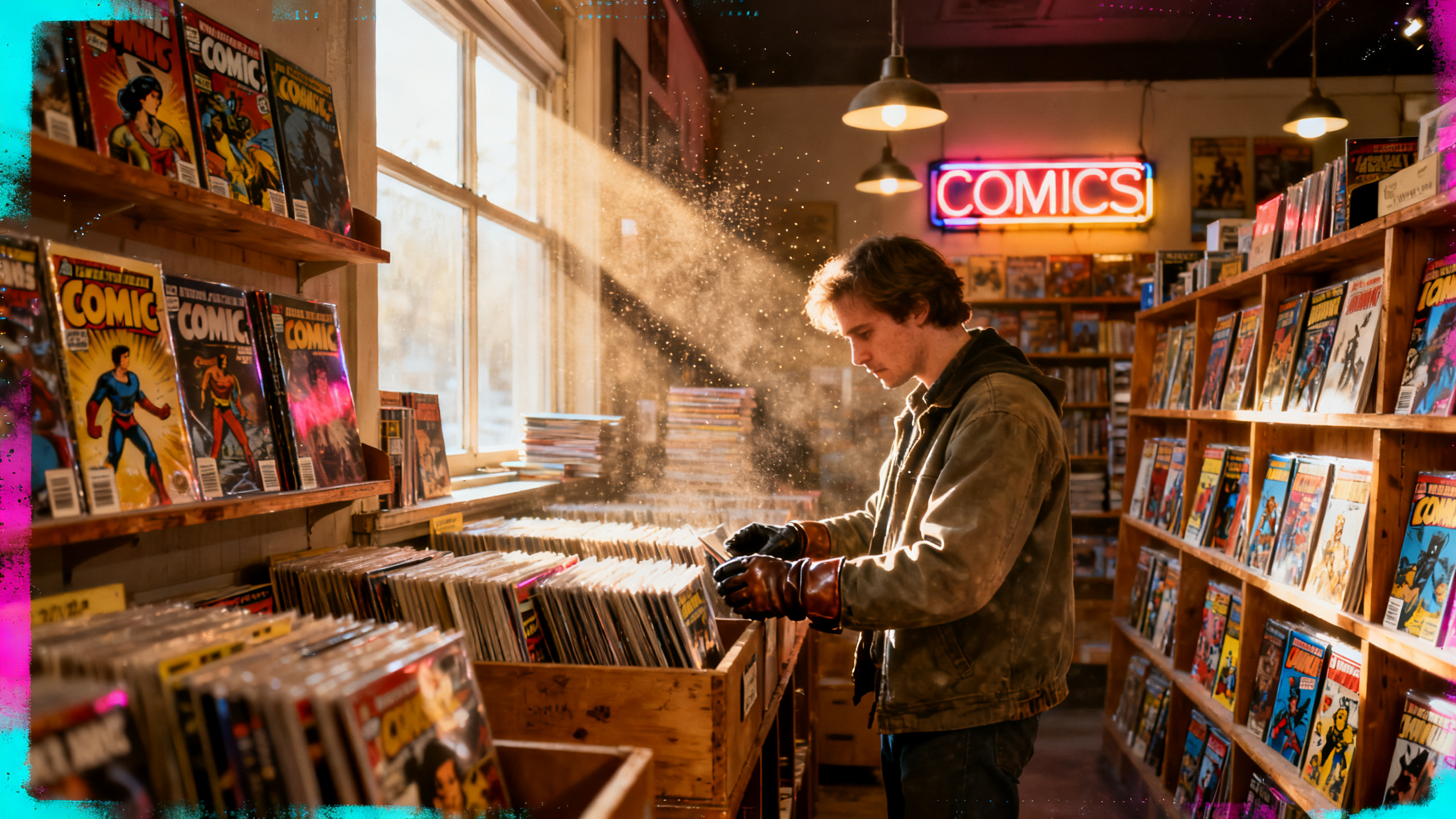
5. Real Photos of Your Actual Store
Stock photos of generic “comic book” scenes are a trust killer. Anyone who’s been in a real comic shop can spot them instantly, and they signal that your website isn’t really about your shop — it’s just a placeholder.
Real photos of your actual space — your bins, your walls, your staff, your regulars on new issue day — do something stock photos can’t: they make people want to come in. Atmosphere is a huge part of why people choose a local comic shop over just ordering online. Your website photos should capture that atmosphere.
You don’t need professional photography. Honest, well-lit phone photos of your real store are better than polished stock images every time.
6. A Clear Reason to Come Back
A website that’s only useful once — to find your hours and location — is missing an opportunity. Your best customers will visit your site multiple times if there’s a reason to come back.
This could be a new releases post every Wednesday. It could be a staff picks page that gets updated monthly. It could be an events calendar. It could be a blog where someone on your team writes about comics in a way that feels authentic to your shop’s personality.
Whatever format works for you, the goal is the same: give people a reason to check back in, so that when they’re ready to visit or buy, your shop is the one they think of.
7. A Call to Action That Isn’t Just “Contact Us”
Every page of your website should have a clear next step. For a comic shop, the right call to action depends on what you want to accomplish:
- If you want people to visit: “Get Directions” with a direct link to Google Maps
- If you want pull list signups: “Start Your Pull List” with a simple form
- If you offer buying/trading: “Sell Us Your Collection” with a clear process
- If you want newsletter signups: A simple email capture with a genuine reason to subscribe
“Contact us” is too vague and too low-commitment to convert casual visitors. Give people a specific, low-friction action to take, and more of them will take it.
The Gap Between a Working Website and a Great One
Getting these seven elements right doesn’t require a full redesign or a big budget. Most of it is content and configuration — things that can be fixed on your existing site if it has a decent foundation.
What it does require is someone who knows what they’re looking at and has time to do it properly. Which is exactly why most shop owners put it off indefinitely — the gap between “knowing what needs to happen” and “having time to do it” is where websites go to stagnate.
Want Us to Take a Look?
We offer a free audit for independent retailers where we assess your website against exactly these criteria and tell you what’s holding you back. No sales pitch — just an honest assessment of what’s working and what isn’t.
We’re Nostalgik Brands — we work exclusively with nostalgia-driven indie retailers, and we’ve helped shops go from basically invisible online to consistently ranking at the top of their local market. See what that looks like on the Nostalgik Vibes case study page.
If you’re ready to have a website that actually works as hard as your shop does, learn more about what we do for comic shops.